What a Bookkeeper Actually Needs From Their First Website
· Web Design

Most first websites are business cards that happen to live on the internet. In this case study, I break down what I built for a Victoria bookkeeper instead: four pages, local-first SEO, structured data, and analytics, and why the site's real job is filtering leads before the call.
Key Takeaways
- A first website is a filter, not a brochure. Its most valuable job is ending mismatched conversations before they reach a discovery call.
- Four strong pages beat twenty thin ones: scope, services, and objection handling, stated plainly.
- Anchor local first. A brand-new domain wins a specific market before it competes for a national one.
- Structured data and analytics belong at launch, not ninety days later when someone asks whether the site is working.
When a Business Card Lives on the Internet
When a service professional gets their first website, the temptation is to treat it like a business card that happens to live on the internet. With just their name, services, and phone number, they're "done" and can leave it until they're ready to change it in a year or so.
That is almost never what they need.
Earlier this year, I built and launched twbooks.ca for Whethams Books, a bookkeeping and tax practice run by Trishia Whetham here in Victoria. Trishia is a Certified QuickBooks ProAdvisor working with small businesses, sole proprietors, and independent professionals; the kind of practice that grows almost entirely on referral until it hits a ceiling. The website was the tool to prevent them from being limited by such a ceiling.
Here's what the project actually involved, and what I'd tell any other first-time client in the same position.
The Real Problem Wasn't Visibility. It Was Qualification.
Trishia wasn't struggling to be found by people who already knew her name. She was spending time on intro calls with people who may not have been a fit for them. Or not the right fit given the moment in time: businesses too large for a solo practice, people looking for a $200 annual tax filing, and prospects who wanted software she doesn't work with.
A website solves that before the call happens. Every page on twbooks.ca is doing quiet qualification work in the background, using best web practices in displaying the business accreditations, specialties, and services:
Scope of practice, stated plainly.
Individuals, sole proprietors, and small corporations. Not enterprise.
Software, stated plainly.
Primarily QuickBooks Online, with experience in FreshBooks, Sage 50, and QuickBooks Desktop. That one line ends a lot of mismatched conversations early.
Capacity, stated honestly.
The FAQ says availability for new bookkeeping clients is limited, and that if it isn't a fit, she can often point elsewhere. Counterintuitive, but it filters, and it builds trust. It also builds authority within a defined service and client niche: becoming a "master of one or some" rather than a "jack of all trades but a master of none."
A price anchor.
Promptly displaying that personal returns start at $75 sets expectations before anyone fills out a form.
The Four Pages That Actually Mattered
The site launched as a tight four-page structure, and I'd defend that against a twenty-page site every time. Thin-content pages that explain the same thing repeatedly only drag users on a needless journey, and expansion can wait until there's real depth to add:
| Page | Job |
|---|---|
| Home | Establish credibility, geography, and the core offer in one screen |
| Bookkeeping Services | Monthly bookkeeping, catch-up, clean-up, reconciliations; the recurring-revenue core |
| Tax Services | Personal, sole proprietor, and small business returns; GST/HST; prior-year catch-up |
| FAQ | Objection handling: pricing, process, software, and "what if I'm behind" situations, giving potential clients who don't want to admit being years behind on filing permission to reach out |
Local SEO First, Everything Else Second
Trishia can serve clients anywhere in Canada; bookkeeping is now remote work. But that doesn't mean the site should launch targeting "Canada."
The strategy was to anchor hard on Victoria and Vancouver Island first, then widen. Reasons:
- Local search intent converts dramatically better than generic service intent.
- The local pack rewards city-level specificity. "Victoria, BC" outperforms "Vancouver Island" as a primary anchor because it's the higher-volume search term and the stronger local signal.
- A brand-new domain has no authority to compete nationally. Winning a small, specific market first is how you build the authority to compete for anything bigger.
So every meta title leads with the geography. The service pages name the city. The schema names the service area explicitly (Victoria, Greater Victoria, Vancouver Island, British Columbia, Canada) as a nested set, so search engines understand both the local anchor and the national capability.
Here's what that looks like in practice, the meta tags for this very article:
Title: What a Bookkeeper Needs From a First Website | Victoria BC Description: How I built twbooks.ca for a Victoria bookkeeper: the four pages, local SEO, schema, and analytics decisions that turn a first website into a client filter.
The title leads with the audience and the problem, then anchors the geography at the end where it still registers without crowding out the hook. The description names the client, the city, and the four things the article actually delivers, so the click is qualified before it happens. Same principle as the site itself.
Structured Data: Telling Search Engines What the Business Is
This is the part most first websites skip entirely, and it's increasingly the part that matters most, especially as AI assistants become one of the dominant discovery channels.
A page that says "Trishia Whetham is a Certified QuickBooks ProAdvisor in Victoria" is readable by a human. A page with proper JSON-LD schema says the same thing in a format machines can act on:
- AccountingService as the business type, not the generic LocalBusiness default, and not ProfessionalService. Specificity matters.
- Person markup for Trishia herself, with her credential (Certified QuickBooks ProAdvisor, recognized by Intuit) as a structured EducationalOccupationalCredential rather than a sentence buried in an About paragraph.
- Service blocks with real pricing offers attached.
- FAQPage markup on the FAQ, which can earn expanded results in search.
One implementation note worth its own paragraph: the site runs Yoast, which already emits Organization, WebSite, WebPage, and BreadcrumbList on every page. Adding a second business entity would have created a duplicate node and muddied the graph. Instead, the custom blocks reference Yoast's existing organization by @id, so everything attaches to one entity. If you're layering custom schema onto a site with an SEO plugin, this is the mistake to avoid.
Want to Check Your Own Site?
Two free tools, no technical background required:
- Google's Rich Results Test: paste your URL in, and it tells you whether Google can read your structured data and what enhanced search results you qualify for.
- Schema Markup Validator (schema.org): a broader check that shows you every entity your site is declaring.
If you run either one on your current website and get "no items detected," that's your answer. It doesn't mean your site is broken; plenty of sites rank without it. It means search engines are guessing at what your business is instead of being told.
Measurement From Day One, Not Day Ninety
The site shipped with Google Tag Manager, GA4, and Search Console configured before launch, not bolted on later once someone asked, "So is it working?"
What that means practically:
- Form submissions are tracked as real conversion events, not guessed at from a contact-page pageview count.
- UTM tagging is in place, so referral sources, business cards with QR codes, and directory listings are all attributable.
- Search Console is connected, and its reports surface in GA4, so organic query data and behaviour data live in the same place.
Why "Set Up Analytics" Is Rarely a One-Hour Job
Two things went wrong during this setup, and both are worth knowing about because they're the kind of thing that quietly ruins a client's data for months.
The form tracking looked fine and wasn't.
Contact form submissions are the single most important number on a site like this; it's the only real measure of whether the website is doing its job. The standard way to track them uses each form's ID to distinguish one form from another. The catch: the ID shown in the form plugin's dashboard is not the ID the tracking tool actually sees on the live page. Configure it the obvious way, and nothing errors out, nothing looks broken, and your conversion count sits at zero forever. It took a custom listener to bridge the gap.
The problem that wasn't a problem.
For a stretch, the tracking code appeared on some versions of a page and not others; the classic signature of a broken install. It wasn't. The site sits behind a caching layer, and visitors were being served a saved copy of the page from before the tracking was added. Nothing was wrong with the setup at all. Clearing the cache fixed it in seconds.
The lesson for a business owner: if someone tells you analytics is a checkbox, be skeptical. And if you've never verified that your contact form submissions actually register as conversions, check. A surprising number of sites have been reporting zero for years.
Design Decisions That Were Really Conversion Decisions
The Eleven-Field Intake Form
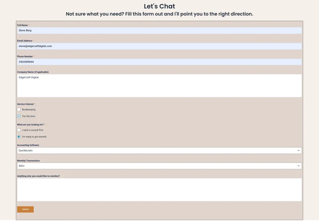
The twbooks.ca intake form, showing only the fields relevant to the selected service
A first-contact form that requests 11 pieces of information in addition to basic contact details is unlikely to be completed. Cut it down; the discovery call is where the details belong. The intake forms were designed to show options that align with the user's responses as they fill out the form. If they're looking for tax services, only tax service questions and checkboxes appear. No "all-you-can-eat buffet" of options here; only giving the user what they need to ensure they fill out the form and submit on the first try.
"Subscribe" Is a Terrible Button Label

The lead magnet CTA: naming the offer instead of the mechanism
Changed to name the actual thing being offered. Buttons should describe the outcome, not the mechanism. A call to action that names the reward, especially when tied to receiving free resources, is infinitely better than just saying "Subscribe." Whethams Books offers a free "cheat sheet" for business expenses, geared towards the exact types of clients they want, with an action statement: "Send me the Cheat Sheet."
Trust Signals in the Footer
Contact details and credentials, present on every page and fully responsive
Placing contact details and credentials where people look for them, not only on a single About page. Available on all pages and mobile responsive, so no details are cut off or lost on less-modern mobile devices.
The Takeaway
A first website for a service business isn't a brochure. It's three things at once: a qualification filter, a trust document, and a measurement instrument. Get those right on four pages, and you'll outperform a twenty-page site that's just a nicer-looking business card.
Interested in Achieving Similar Results for Your Business?
If you're a bookkeeper, consultant, or independent professional thinking about your first real website, this is exactly the work I do. Explore my website design services or see how I approach web design and SEO in Victoria, BC.
Contact me at EdgeCraft Digital today.